Make-your-color-grading-like-a-movie-
https://m.youtube.com/watch?v=iwucr_bP3n8&pp=ygUSZmlsbSBjb2xvciBncmFkaW5n
If you're like myself and many other filmmakers out there, you may spend a lot of time watching
movies and being amazed by their looks. You might wonder how a movie achieves a particular look.
Having the ability to recreate the look of any film you want is going to take you a long way
in your filmmaking journey. It will help you to fulfill the needs of clients who will often ask
you to make a project look like a particular reference and it helps to understand how looks
are built so that you can do it on your own.
So if you're about discovering this DIY approach and mastering your color grading, this video is for you.
We'll break down the process of two well-known films and apply these looks in Premiere Pro, DaVinci Resolve and Final Cut Pro.
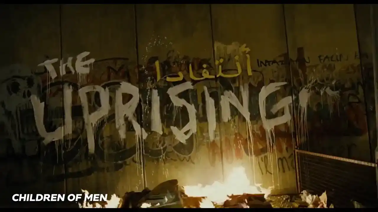
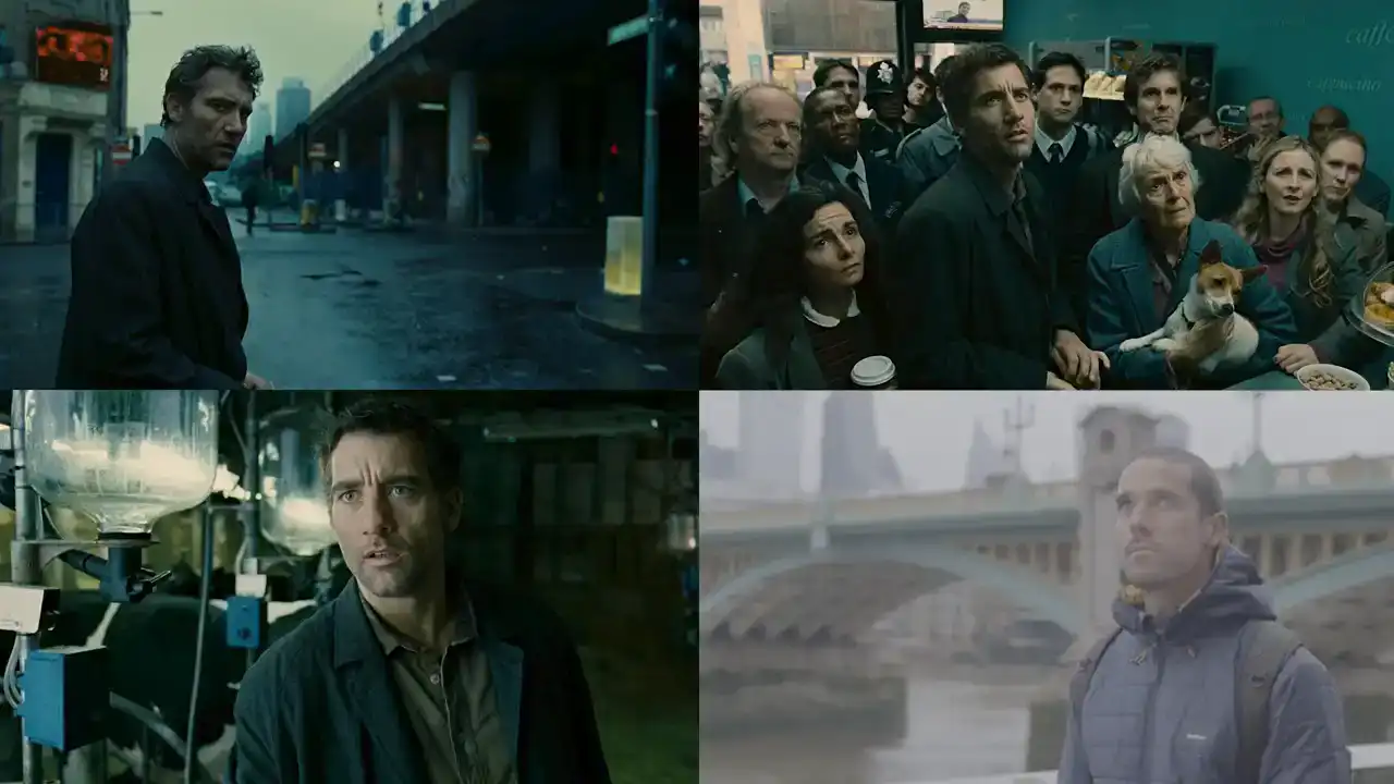
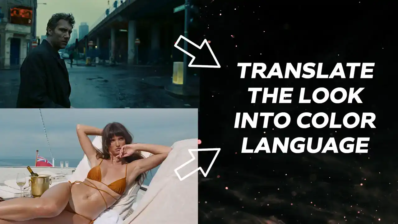
We're going to tackle a modern classic, Children of Men with cinematography by the one and
only three-time Academy Award winning Emmanuel Lubezki.
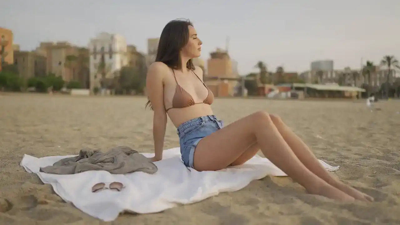
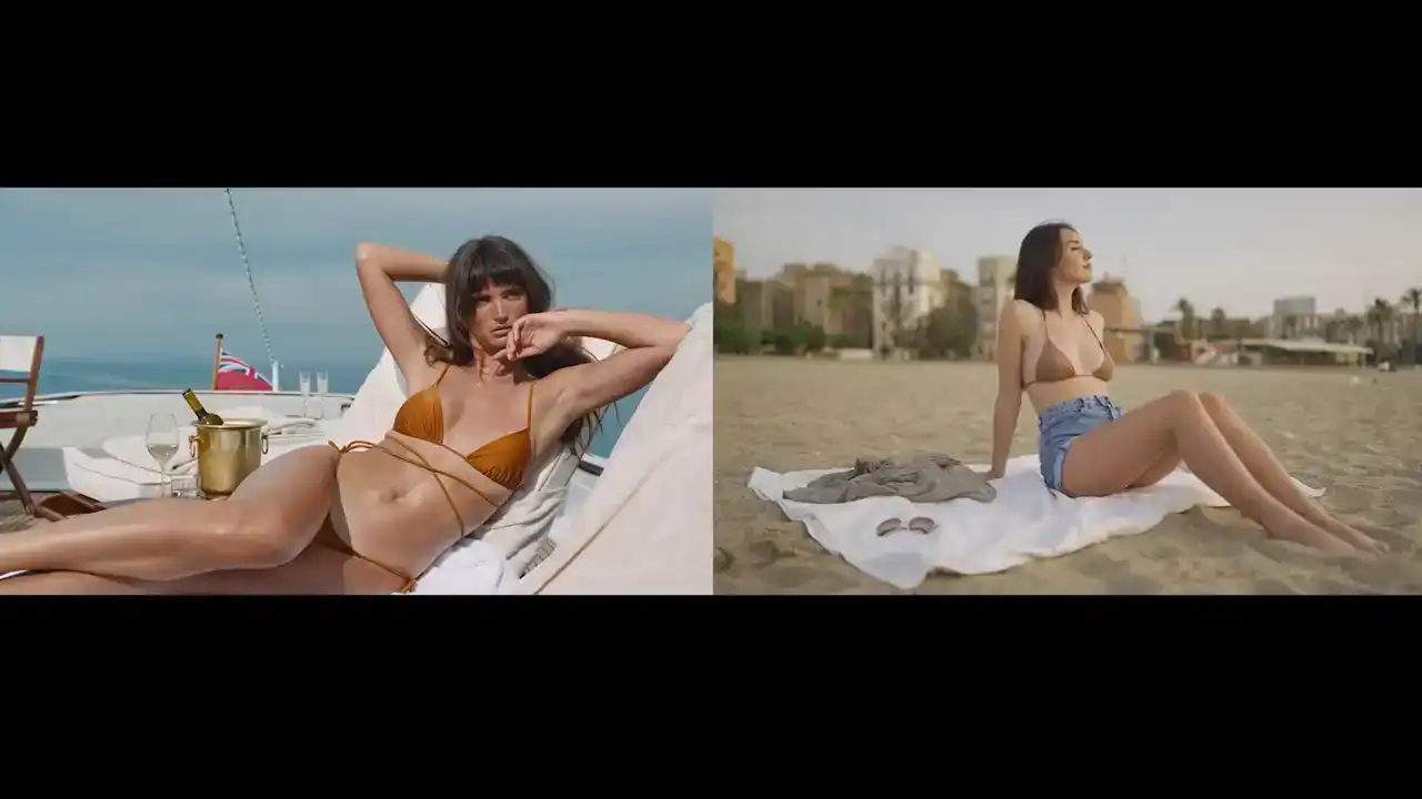
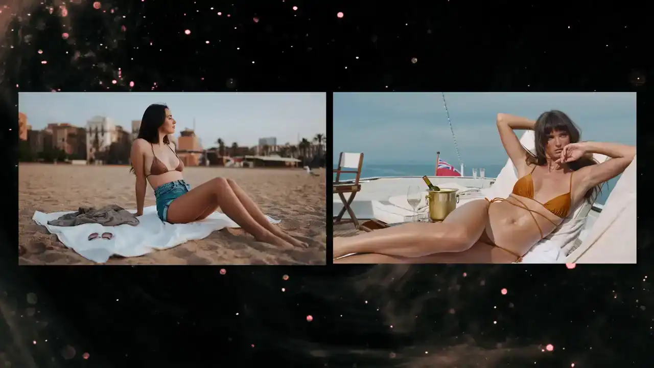
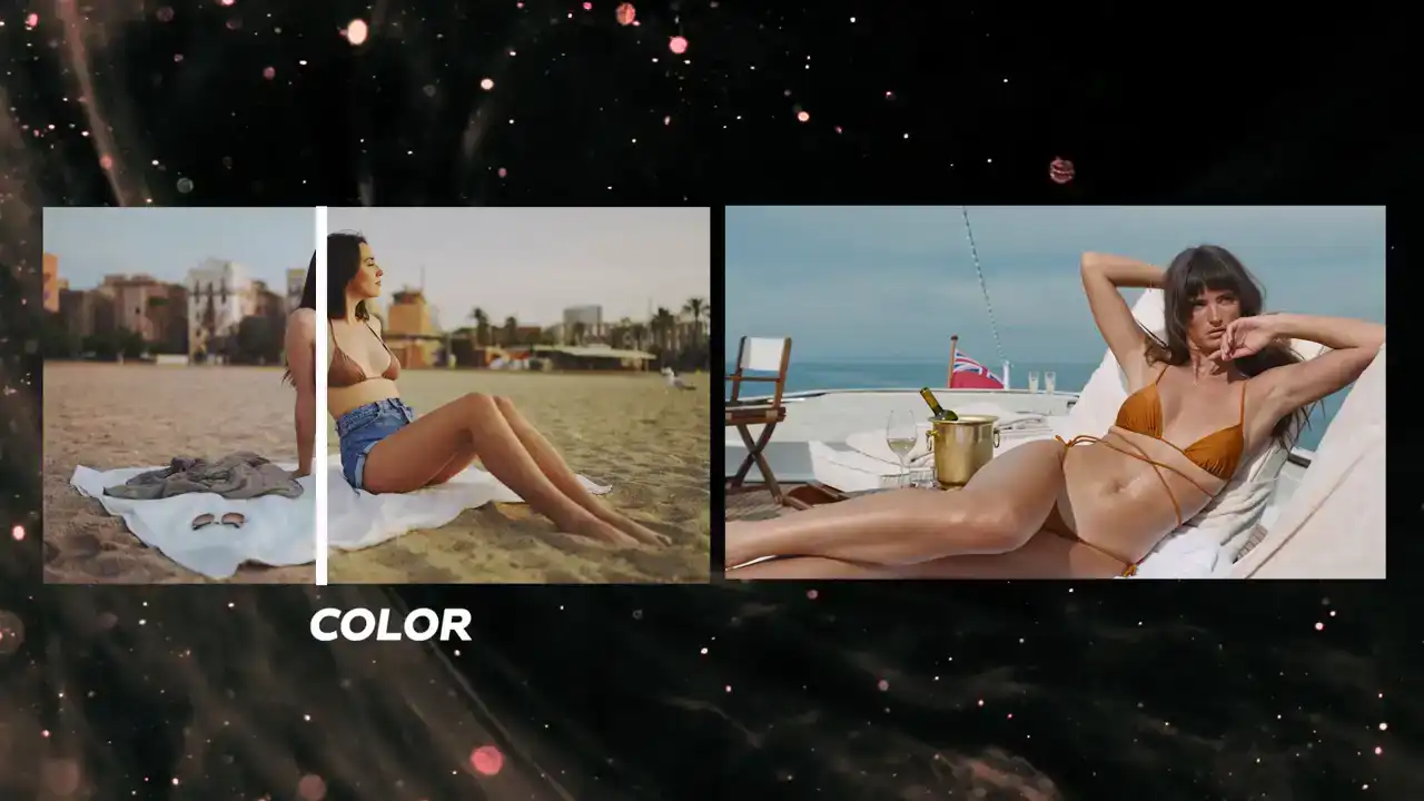
By the end, you'll be able to take your footage from this to this.
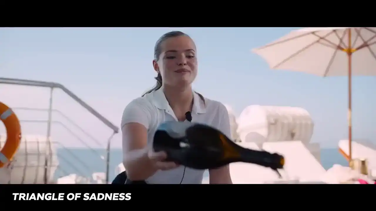
And Triangle of Sadness, nominated for Best Picture in the 2023 Academy Awards,
you'll be able to go from this to this. Let's do it.
All my life I've barely spoken. Your words have been so broken.
I've been under your hypnosis.
Cell phone became your brother. Internet replaced your mother.
Looking at these films and our footage, it may seem like a daunting task to recreate these looks,
but we're going to follow a specific process that'll make this easy enough that you can follow
along. I'll also include a download link for these clips in the description so you can work right
along with me. We're going to ask ourselves a number of questions about the look with the goal
of translating the looks into color language. Then from there, we'll turn that color language
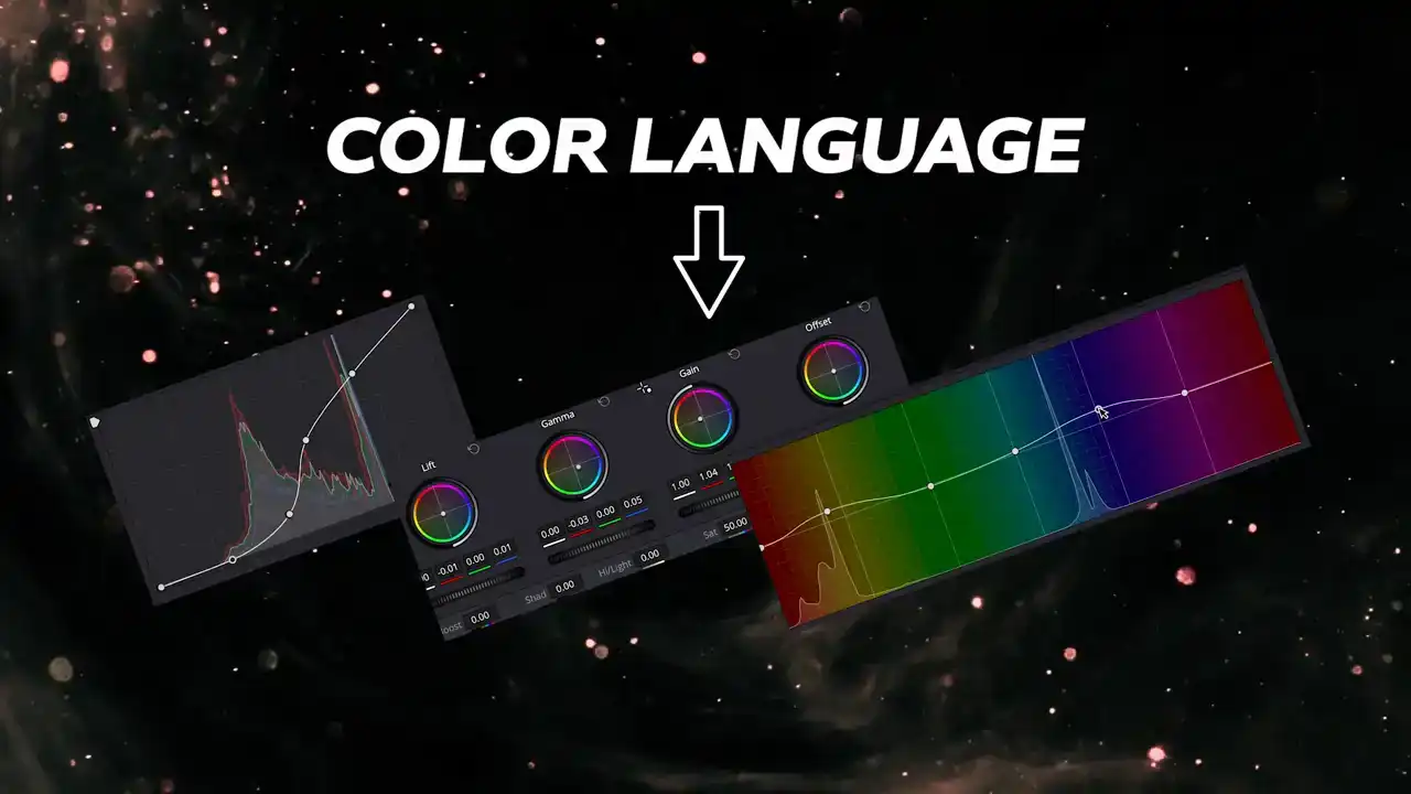
into actionable corrections with the help of the video scopes so we can get these same looks on
our clips. Now, one thing to keep in mind is that it's always ideal to work with footage that has a similar art direction to the look that we're going for. Although we can make some significant changes
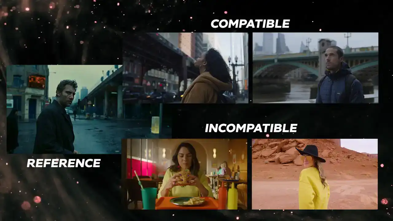
with the color grading tools, there are some limitations to how much we can dictate the art
direction of a scene. Okay, so here are the things you need to ask when evaluating a look. This gets
into the meat and potatoes that most people want to skip over, but believe me, this is the secret

to recreating any look that you want. We need to break down the color language of the look with specific questions about the luma, hue, and saturation of the reference. From there, we can
set about matching each element starting first with children of men. The luma questions we want
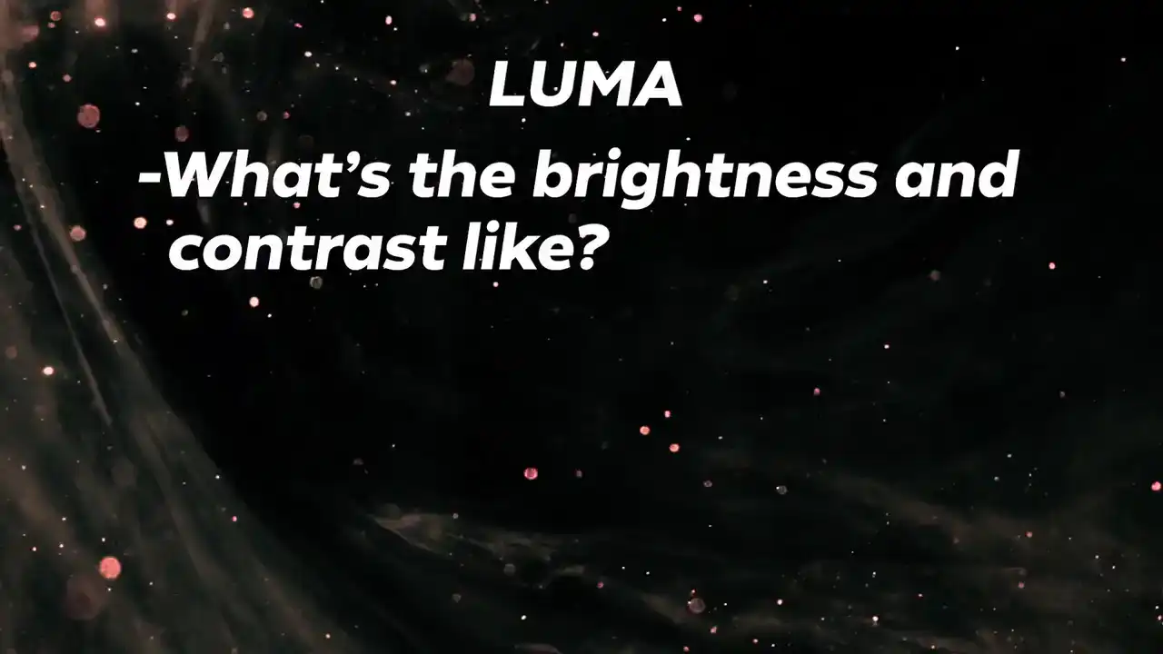
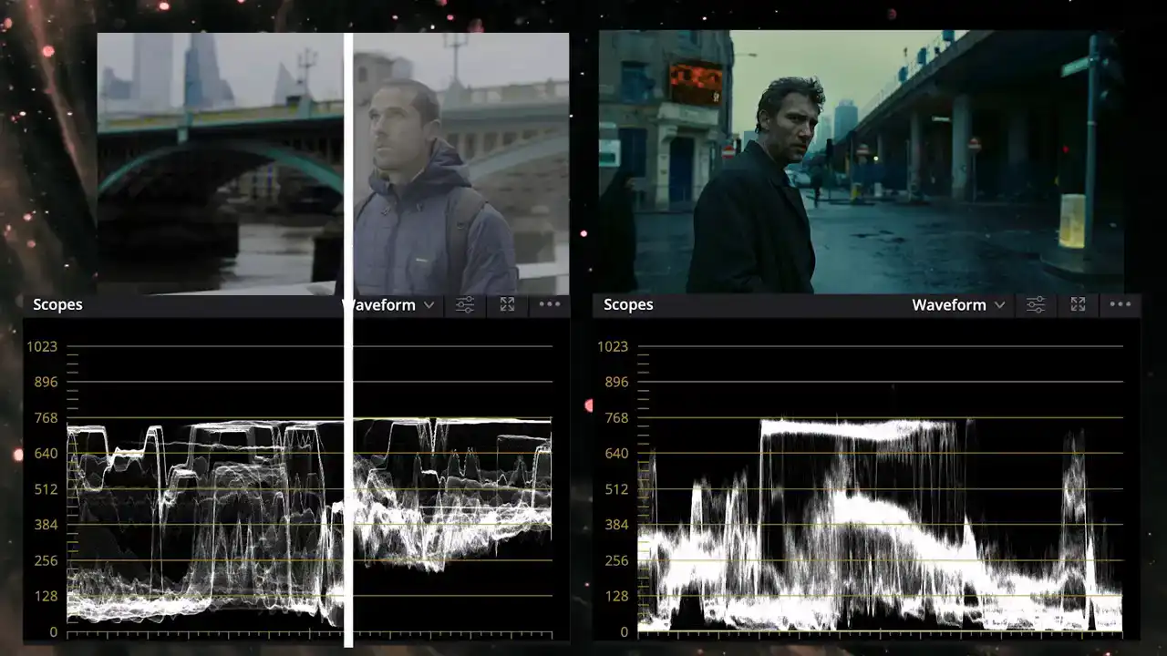
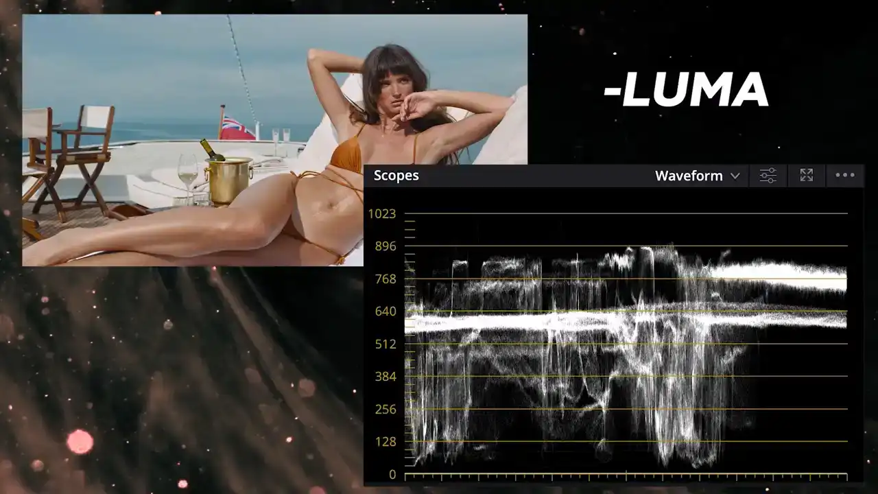
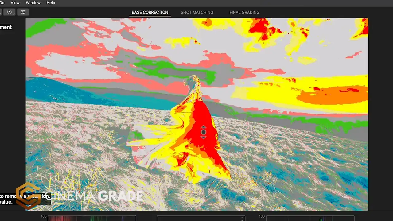
to ask are what is the brightness and contrast like? Is it a bright scene or a dark one? Would Could the contrast be considered high key or low key? Using the scopes as an aid, try to answer these on your own first.
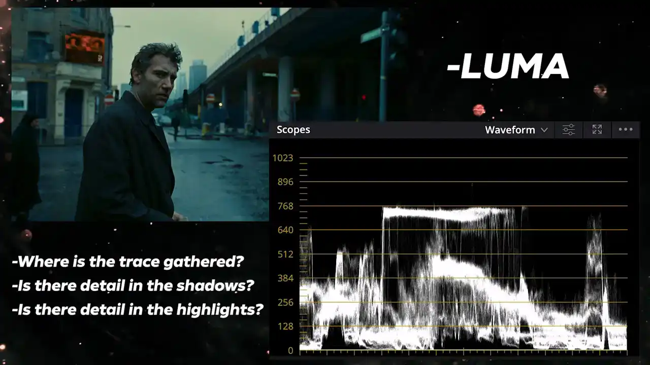
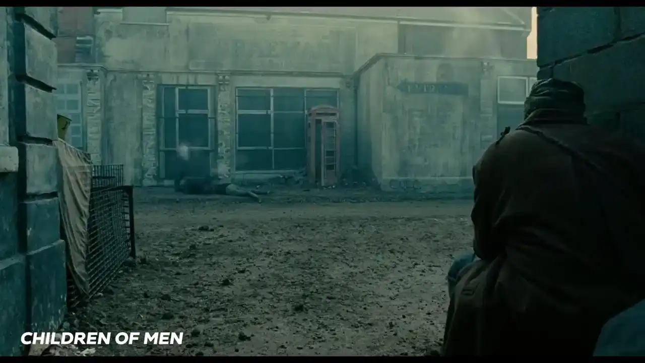
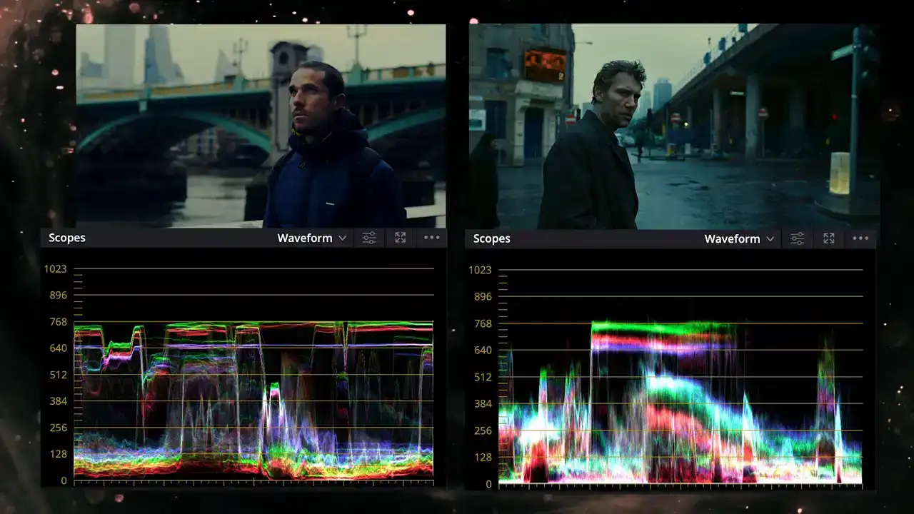
Where is the trace gathered in the waveform Is there detail in the shadows Is there details in the brightest highlights and if so how much We can see this as a dark moody image on an overcast day but with a decent amount of contrast. The trace is mostly gathered towards the shadows and undertones with the contrast extending from the deepest shadows to the highlights around the 70 to 80 IRE mark. I think it's fair to describe this as a low-key look. The highlights maintain detail even with the sky way below the 100 IRE mark. And the shadows, although not crushed, they are pretty deep and don't maintain much detail.
So now that we've evaluated the luma and contrast, let's match it as best we can.
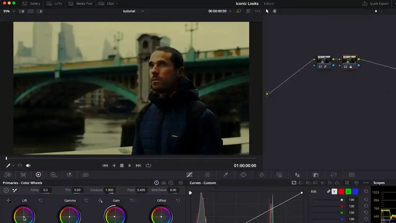
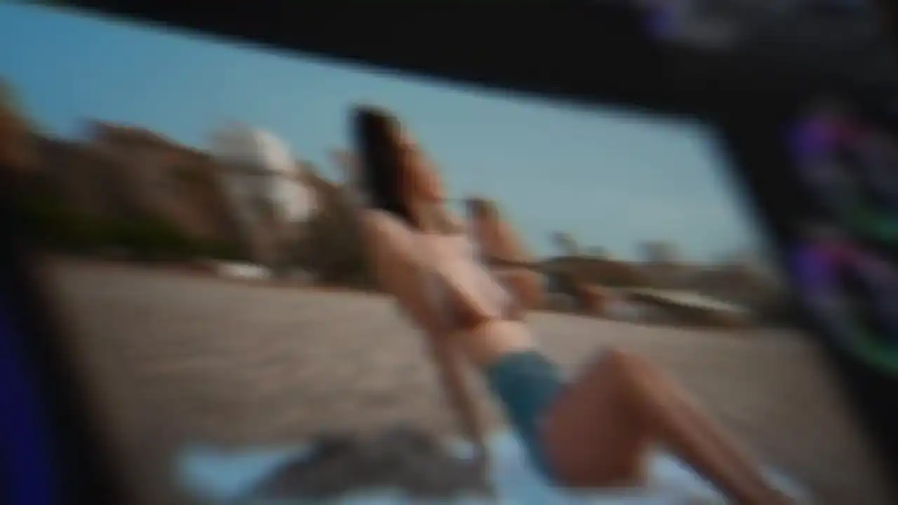
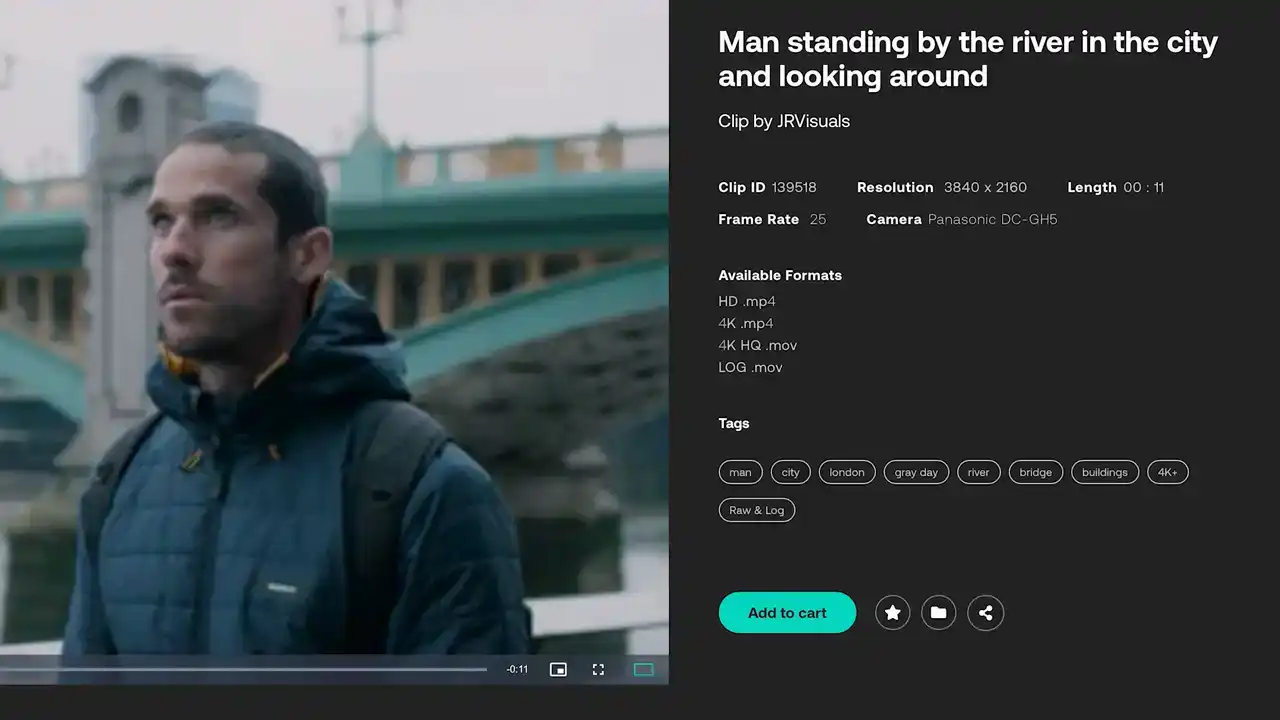
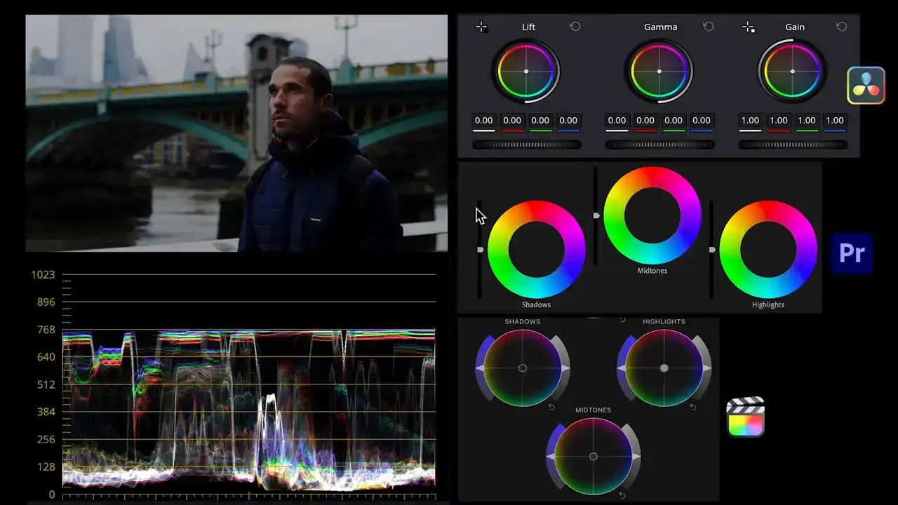
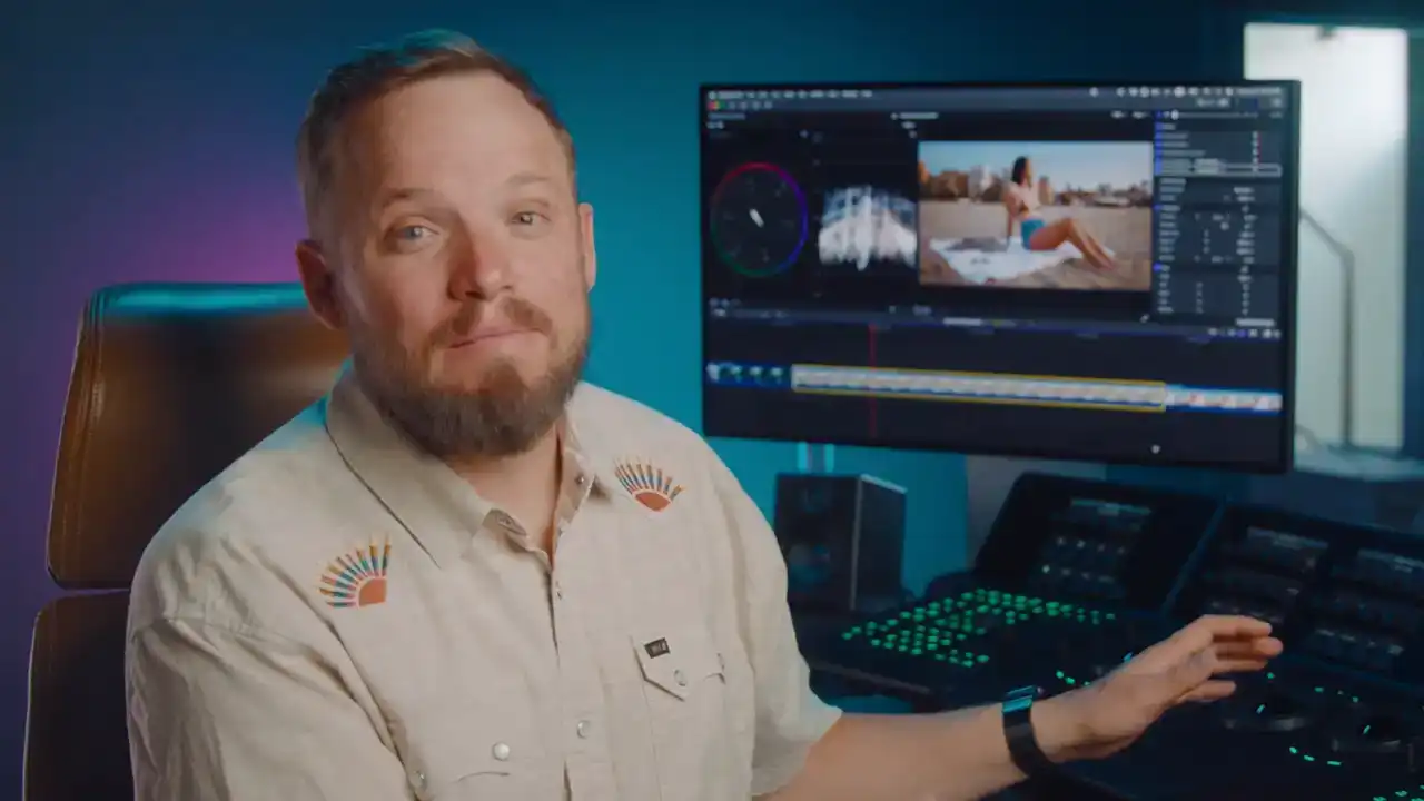
Make sure your footage and the reference are in a side by side view where we can see both
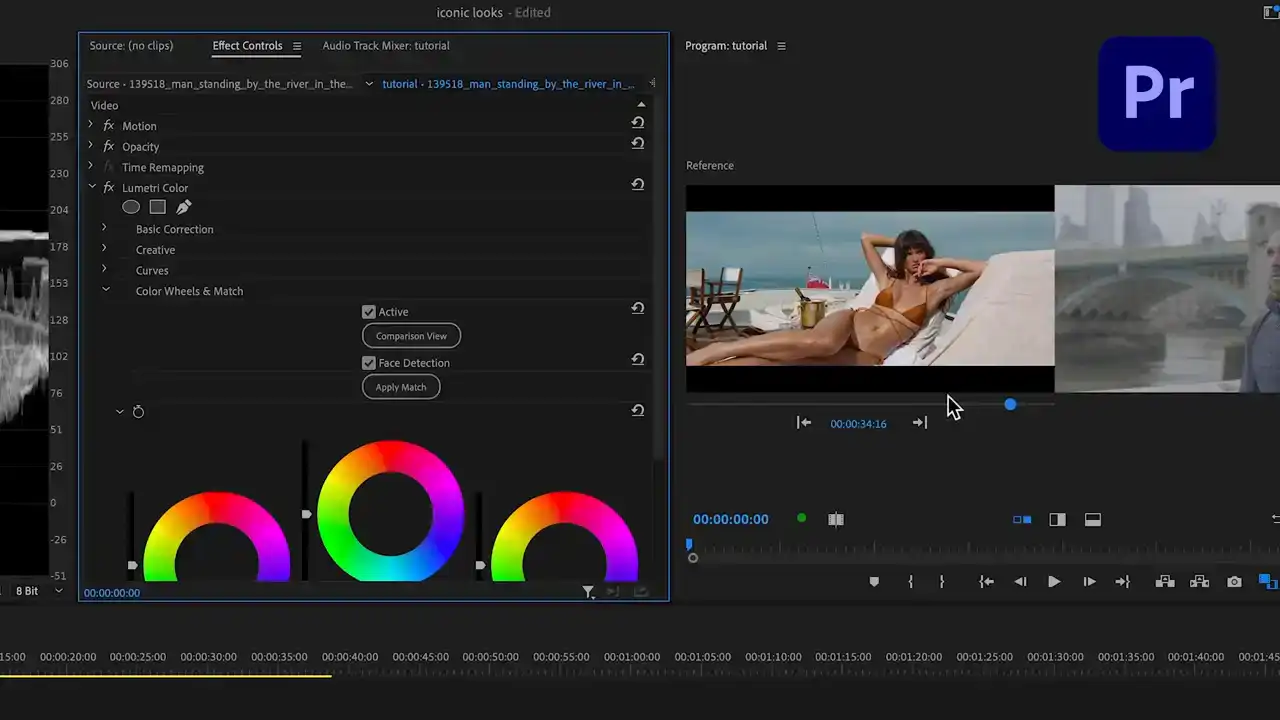
images as well as the scopes.
This can be done in all three softwares since they all have some form of a comparison viewer.
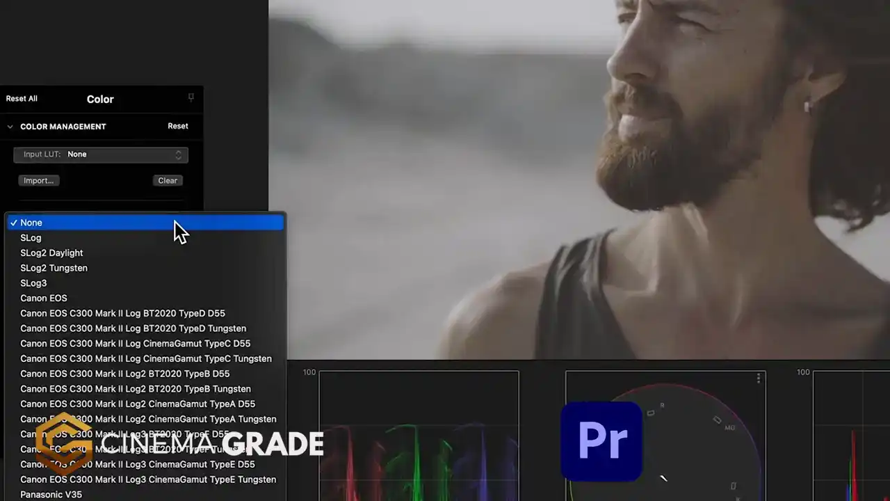
This footage was shot with a log gamma profile so that'll give us plenty of flexibility as we make changes.
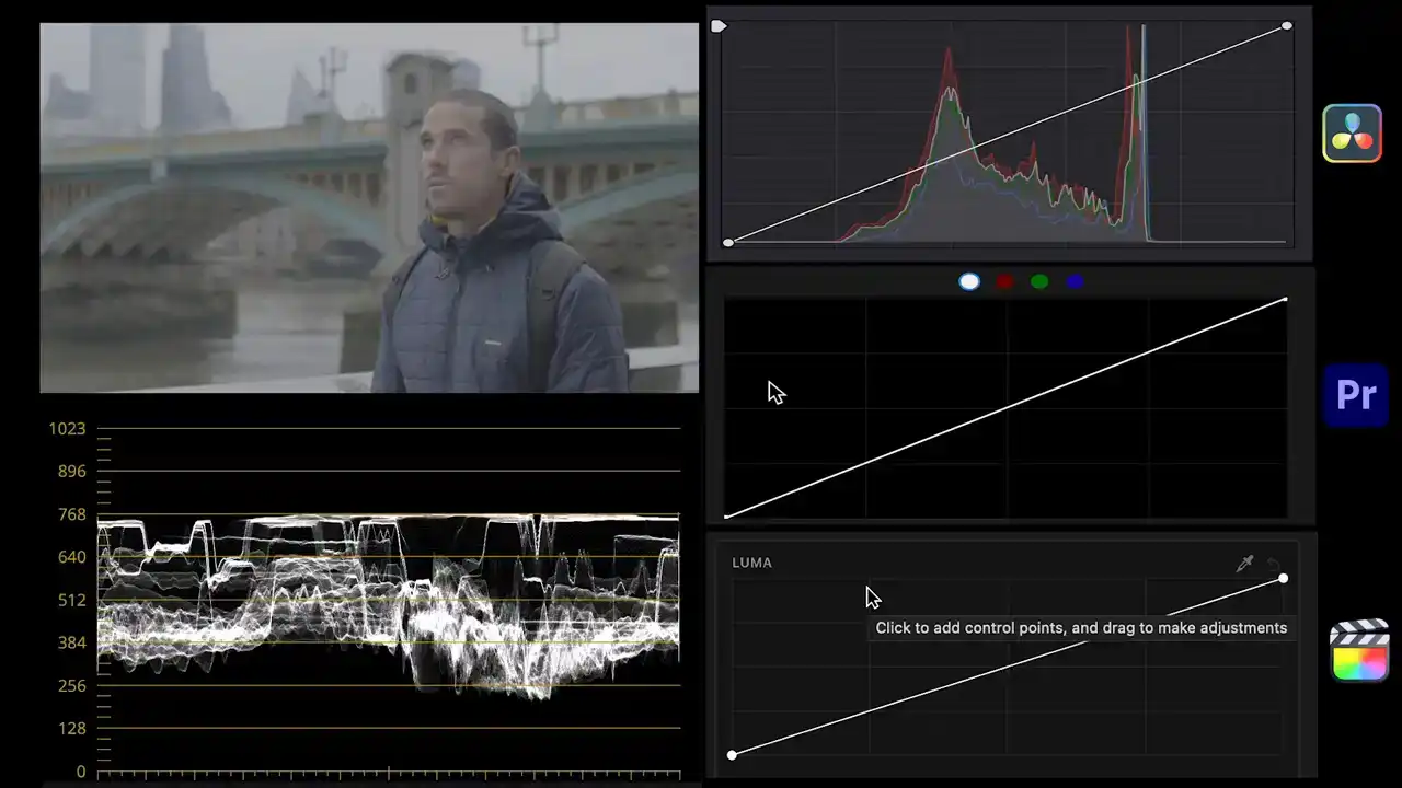
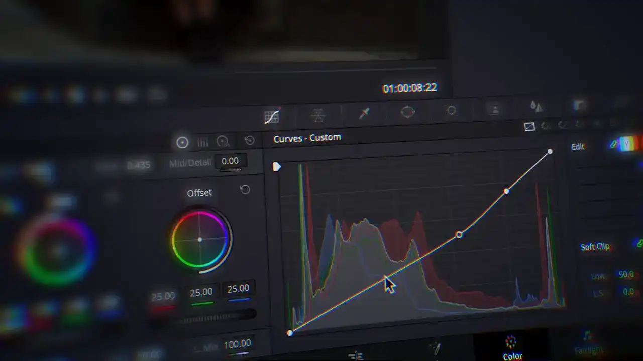
We'll first add contrast with the curves so this works the same in all three programs. The highlights and overtones are already mostly there as we can see in the waveform so we'll leave those alone. The midtones, undertones and shadows on the other hand need to be darkened or brought down to the same level in the waveform. So I'll create points for those ranges and drag them down till they match in the waveform. You'll find that we're doing this in such a way that we end up creating an S-curve which adds contrast to the footage.

There, now that the contrast is matched we can move on to analyzing the color in Children
of Men.
The color questions we want to ask are what colors are there? Is there a strong dominant color? Is there a particular color scheme or color palette?
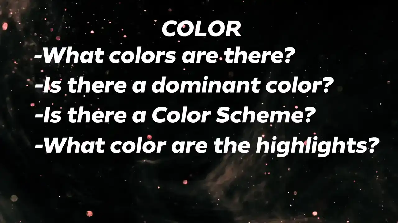
What color are the highlights? What color are the shadows and undertones?
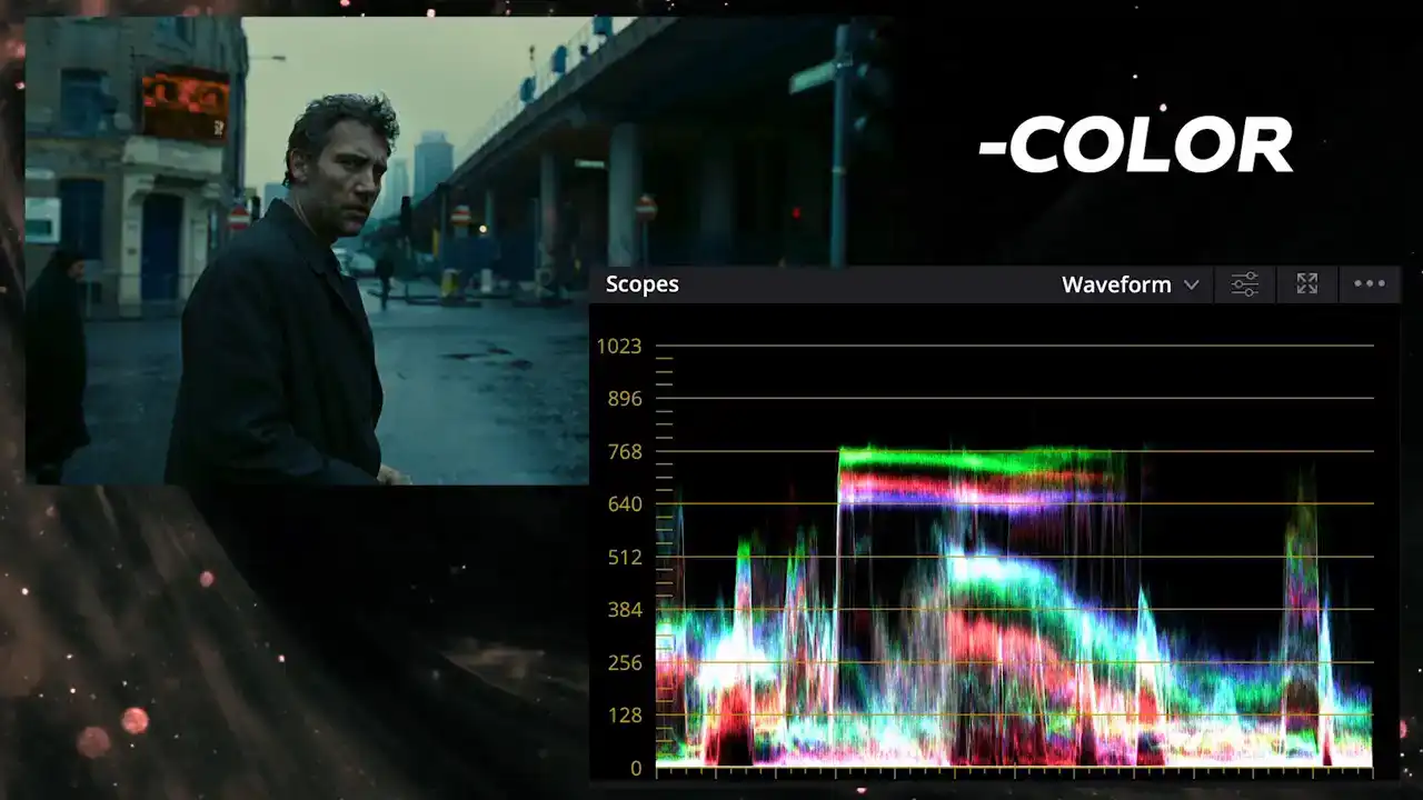
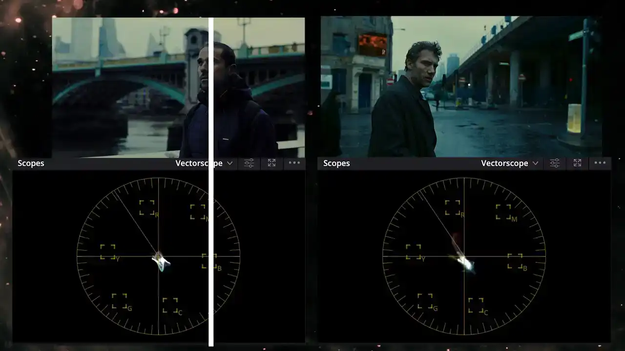
Using the waveform switch to RGB overlay try to answer these first on your own. It appears that Children of Men has some green tint in the highlights which corresponds to the sky while the other highlights are a bit towards blue. In the shadows the green and blue channels are elevated the same for the midtones.
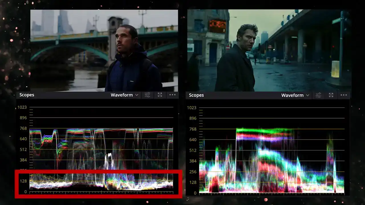
Comparing that with our footage the shadows are balanced, represented as white and pretty balanced for the midtones as well. Before we go any further let's see what insights we can gain from the vectorscope. We can see that the trace points mostly towards the blue and teal spectrum with some spike towards yellow and red created by specific objects in the shot like these red signs and some yellow objects. Comparing to our image there is some yellow in the bridge but not any red so we just need to push our image towards the sign and blue spectrum without losing that touch of yellow. To start matching the colors let's switch back to the waveform in RGB overlay mode and
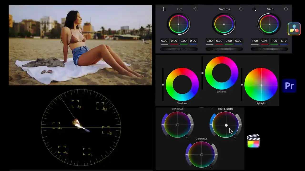
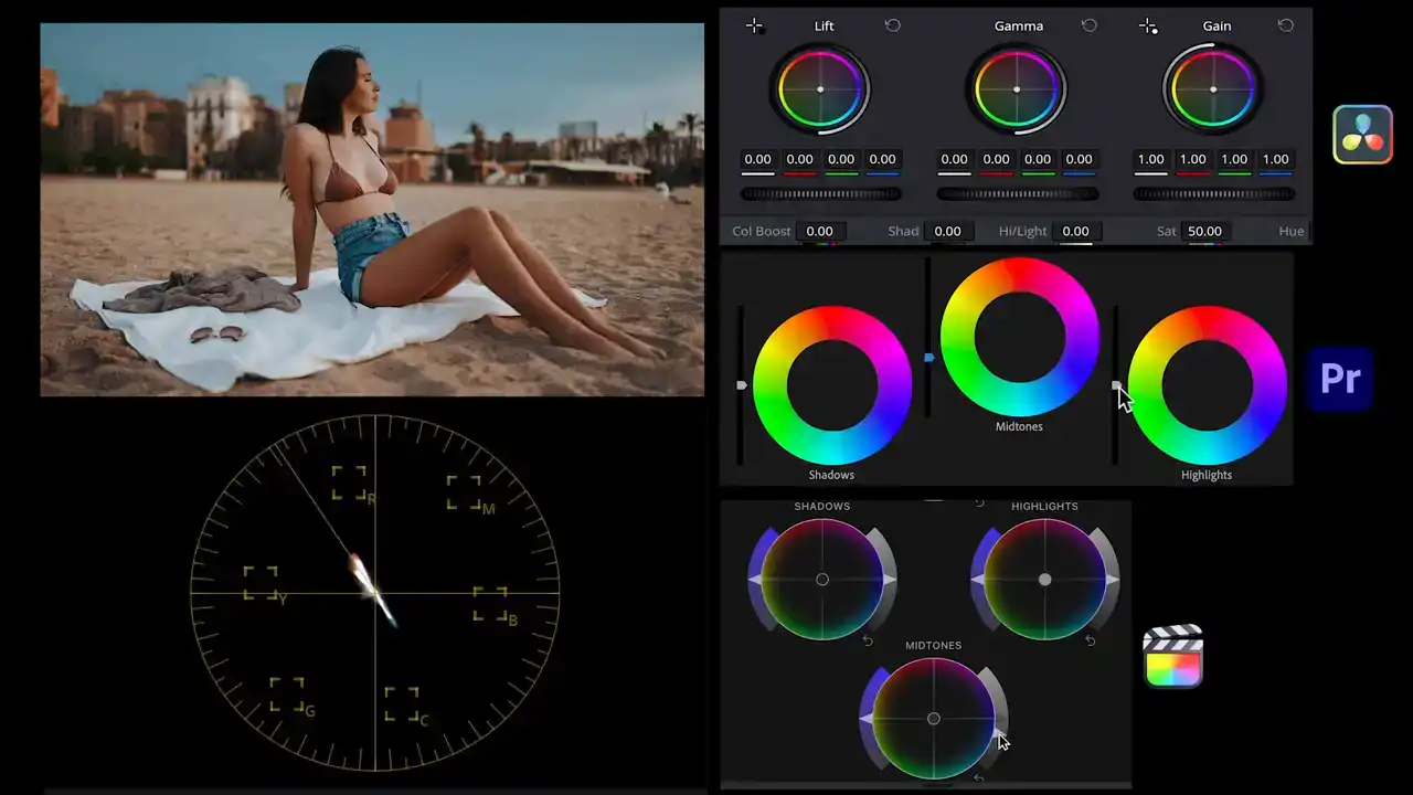
to replicate the colors of children of men we'll use the color wheels on all three softwares. We'll introduce some yellow and green in the highlights, then a bit of blue into the shadows and finally some blue and cyan in the midtones.
Now although our colors are much closer to the Children of Men you see Children of Men has a bluish tone that affects the whole image but isn as intense in the skin tones And that brings us to the next set of questions The saturation questions we want to ask are what are the saturation levels like
Is there a certain object or color that's more emphasized or more saturated than the others?
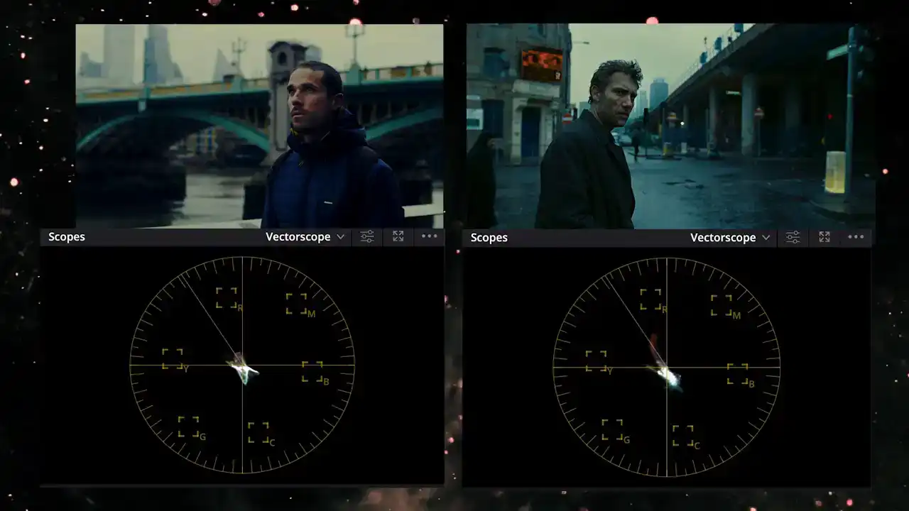
Using the vectorscope as a guide we can tell that the children of men has a bluish tone that affects the whole image but it isn't as intense in the skin tones. To accomplish this we'll use a secondary color correction.
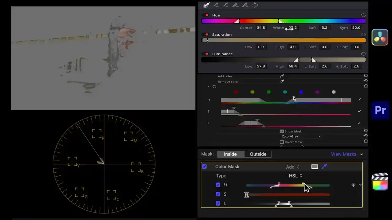
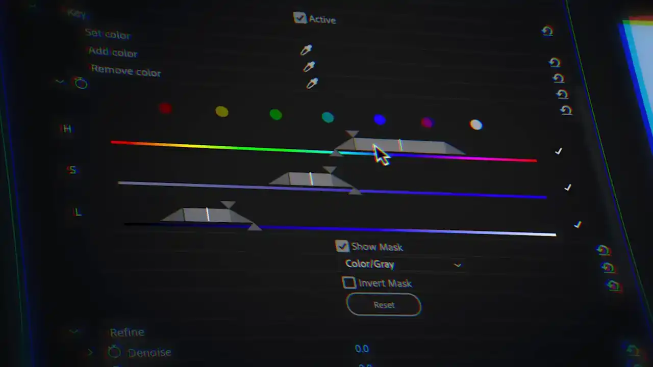
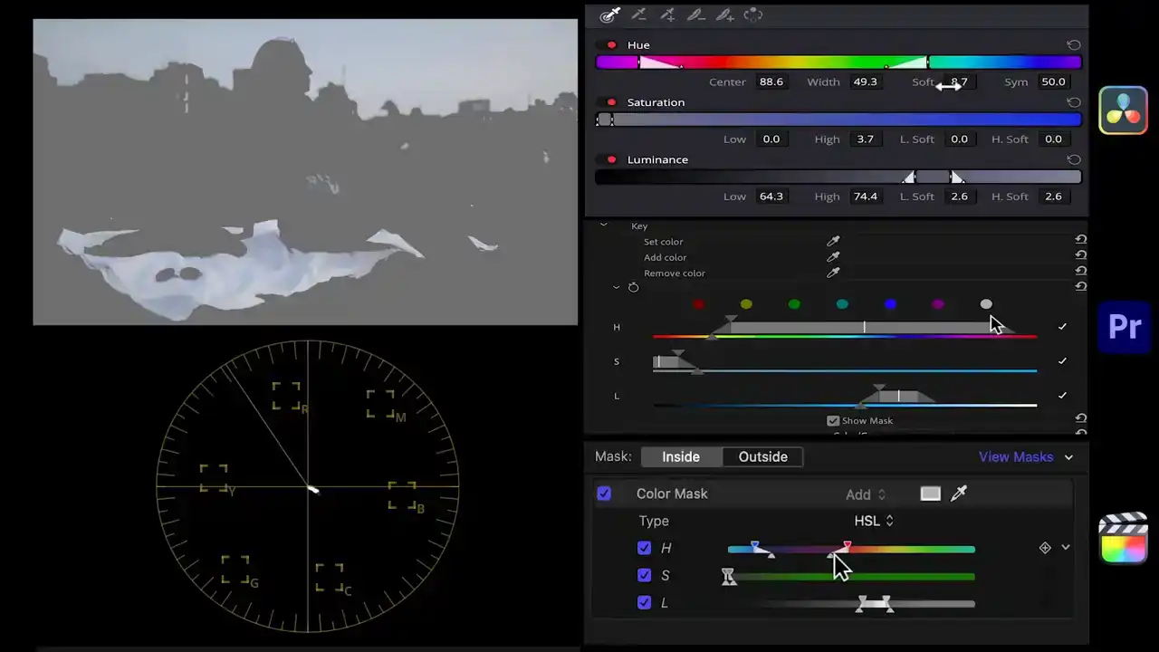
Using the HSL qualifier in Resolve, a color key in Premiere and color mask in Final Cut we'll isolate the skin tones and then invert the selection. Then with the color wheels we'll introduce blue and teal in the midtones and bring down the saturation slightly. Then select the skin tones with the same secondary tools and introduce a tiny bit of blue in the shadows and bring the brightness and saturation down.
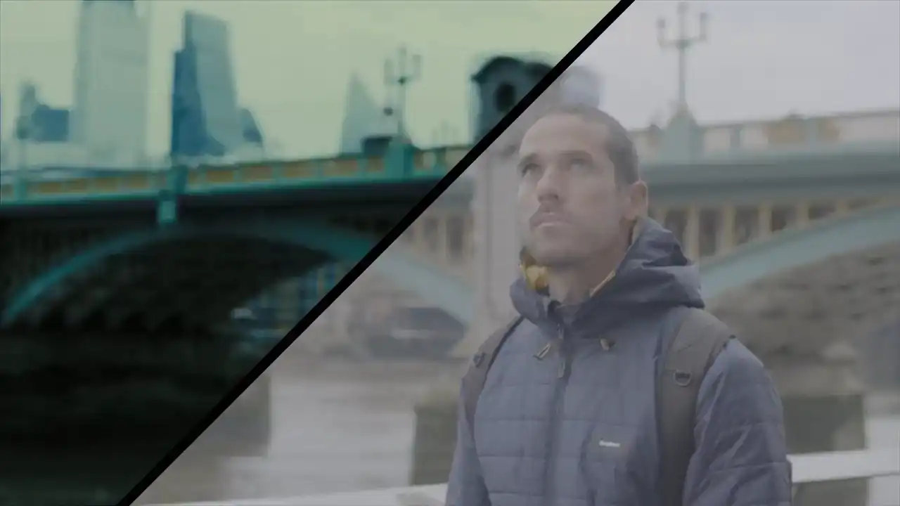
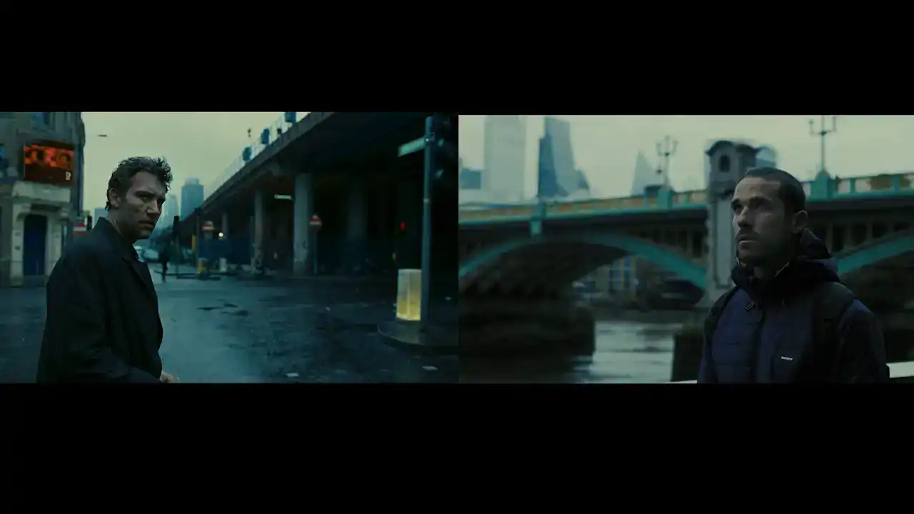
This is where we started and this is where we end up in matching this iconic look of
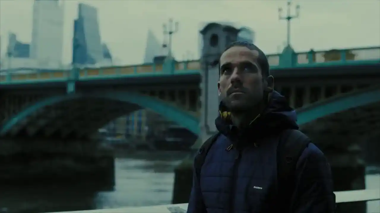
Children of Men.
Let's break down what we did so this workflow crystallizes.
We started with a log image and added contrast comparing the trace between the two in the Luma waveform. Then we replicated the color balance using the color wheels and the waveform in RGB overlay mode and the vectorscope.
And finally, we used a secondary correction to dial in the right amount of blue and saturation to the skin tones and everything else.
If you didn't know any better, you'd think this clip was taken from the same film. Pretty awesome, right?
So let's try this process again, but with a completely different look from the movie The Triangle of Sadness so that you get the practice.
I suggest you try going ahead of me and try implementing this yourself and then see how I do it. Okay?
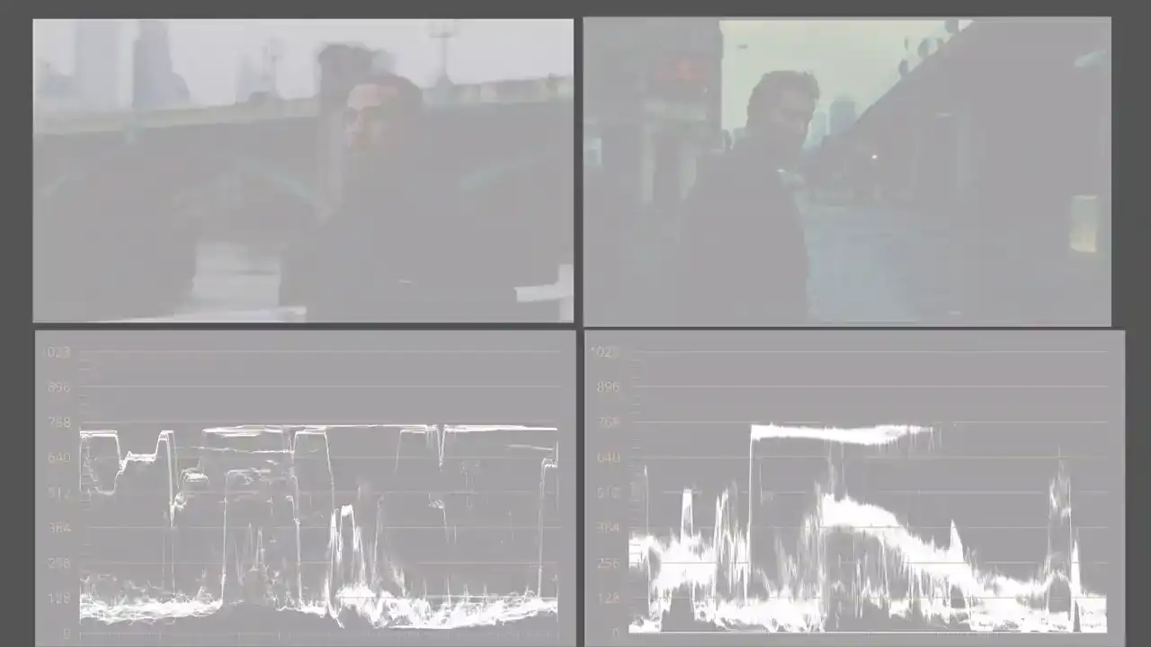
All right, let's put this look into language. In terms of luminance, this is a bright sunny day with rich contrast. Both the highlights and shadows retain lots of detail. Taking a look at the skin tones, they sit right in the middle of the lumen range between 40 to 70 IRE.
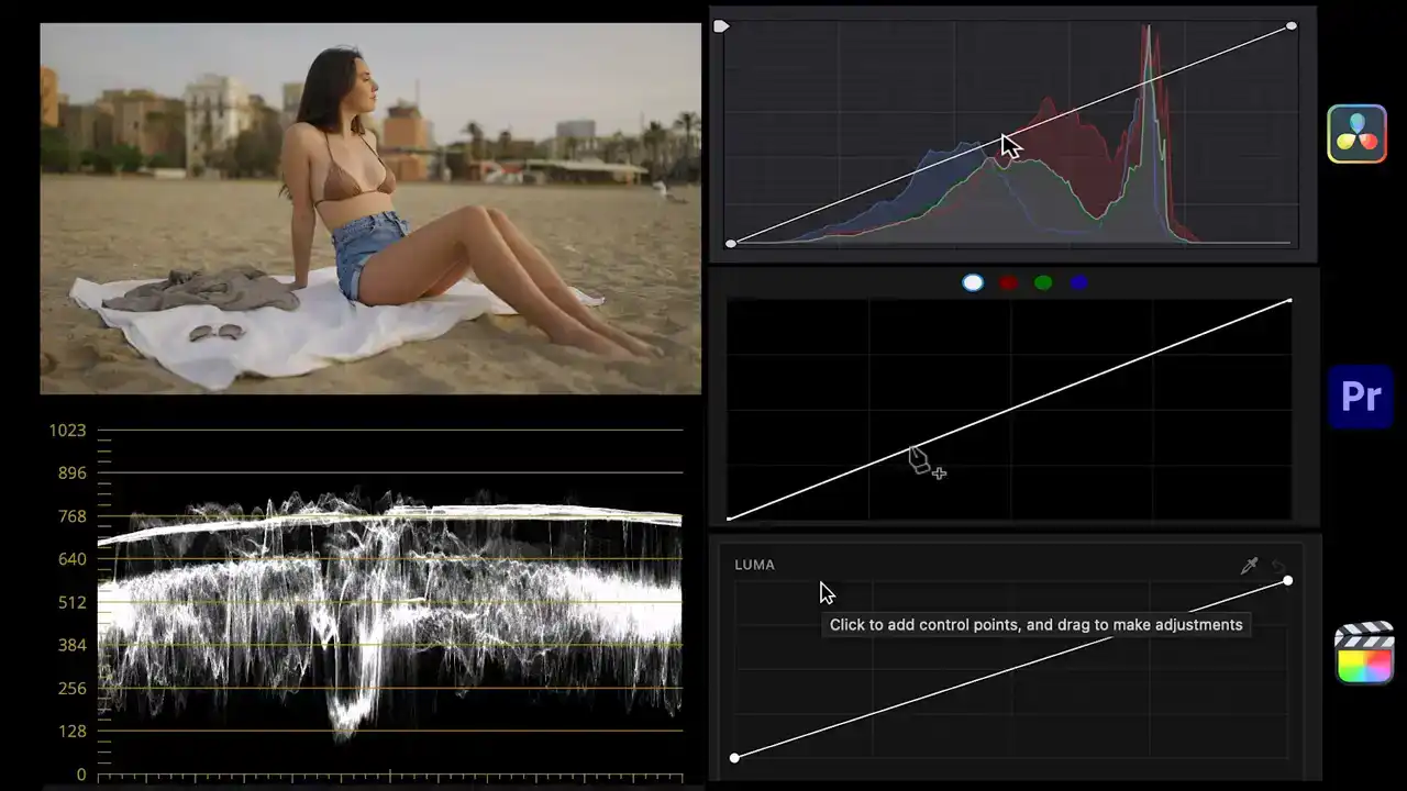
Like before, we'll use the Lumen Curve to make the trace of our image mimic the one from the reference. As you can see, the highlights and overtones are already pretty close but we need to bring the undertones and shadows way down. I'll create points for those and drag them down. In doing this we took our image from dull or flat to a pretty contrasty one. Now let's talk about color.
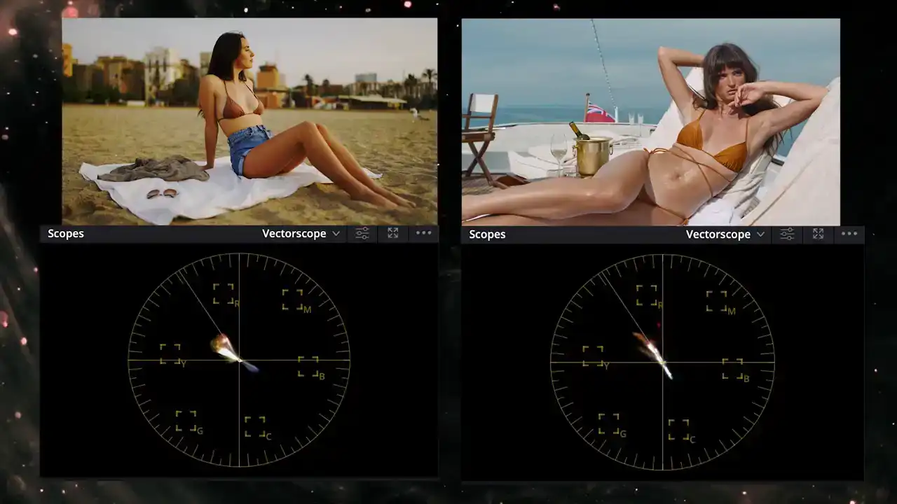
Switching to the vectorscope we can tell the trace from our reference is almost a straight line from orange to teal. Our clip on the other hand is a mix of yellow, red and blue. Our clip also looks very yellowish which is a color balance issue we need to fix before tackling the color scheme.
So with the color wheels we'll introduce blue into the highlights and midtones to cancel out the yellow in those ranges. Next, to go after this color scheme, we'll use the Hue vs Hue curve. Isolating the yellow range will drag the middle point up shifting all the warm tones in our image towards orange And isolating the blue range will drag it up moving the trace towards teal Now we have a straight line almost at the same position as our reference. Now let's talk saturation. Looking at

the extents of the trace our clip seems just a tad more saturated than triangle of sadness. So we'll
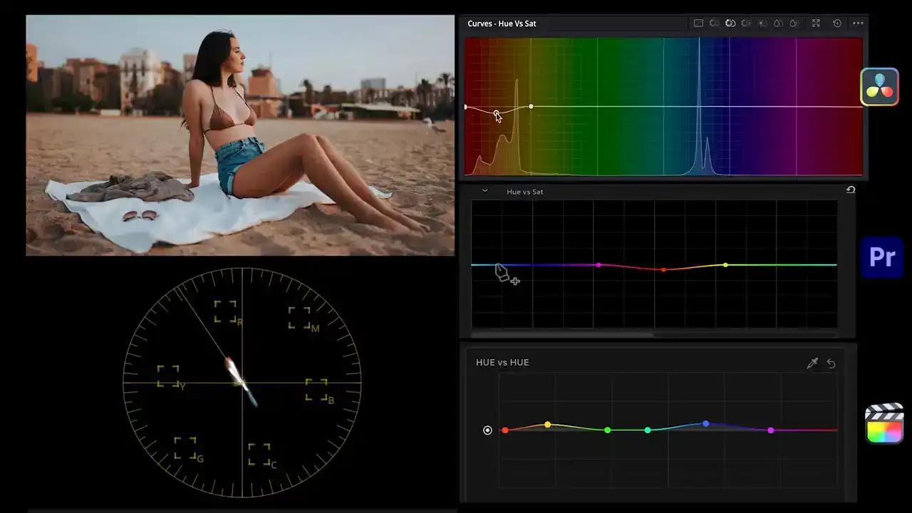
use the Huber Sat Curve to bring the saturation down for the warm and cool tones just a bit.
Now, although we have covered the process for luminance, color, and saturation, there's still an elephant in the room. That is the sky.
Ours is much brighter and washed out compared to Triangle of Sadness.
To address this, we'll use a color key in Premiere, a qualifier in Resolve, and a color mask in Final Cut. We may also need a shape mask. We'll isolate the sky, bring its brightness down, add a bit more till, and bring up the saturation.
Then as a final touch for the skin so they have the same tanned quality, we'll isolate
the warm tones, darken the skin tones, and bring down the saturation just a bit.
Now let's disable all corrections and enable them one by one.
First we matched contrast, then the color with a teal orange look, and finally did some secondaries to match the sky and the skin. It looks absolutely amazing.
As you can see, this is a powerful system for understanding how to break down a look into language and then recreate the look of any film in a do-it-yourself kind of way.
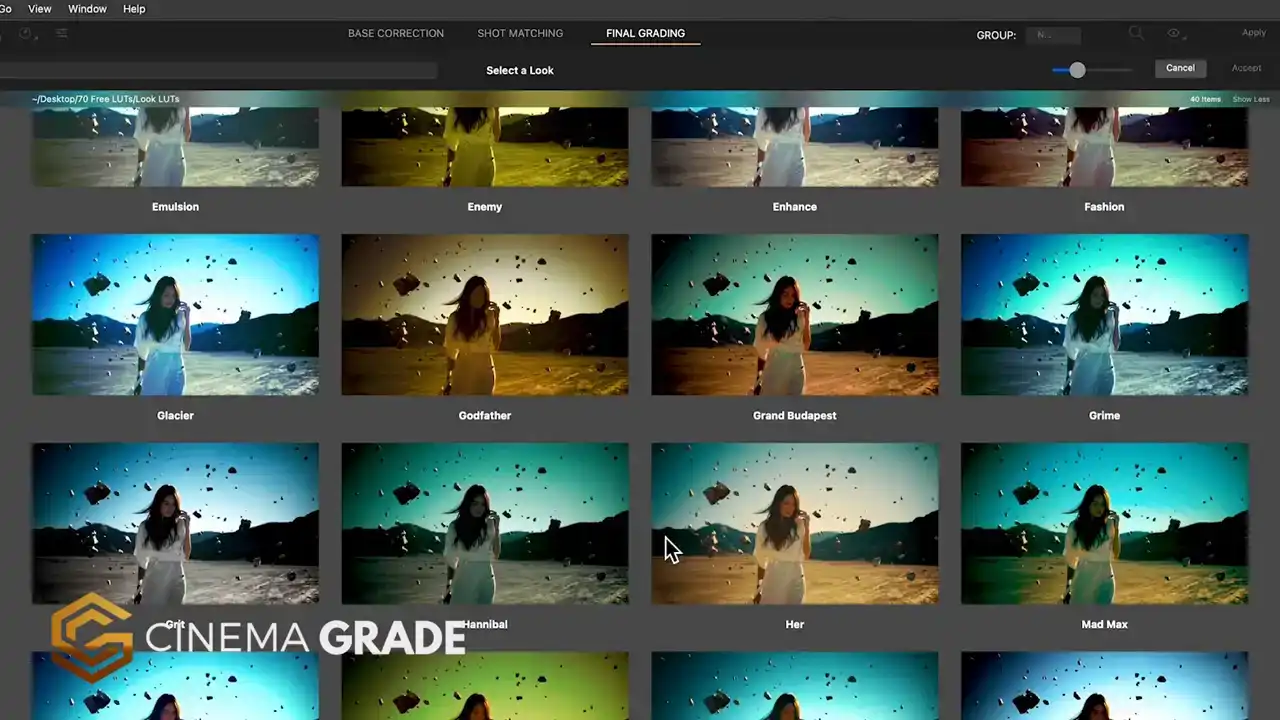
If you've enjoyed this, I want to introduce you to CinemaGrade, another powerful tool for your toolkit.
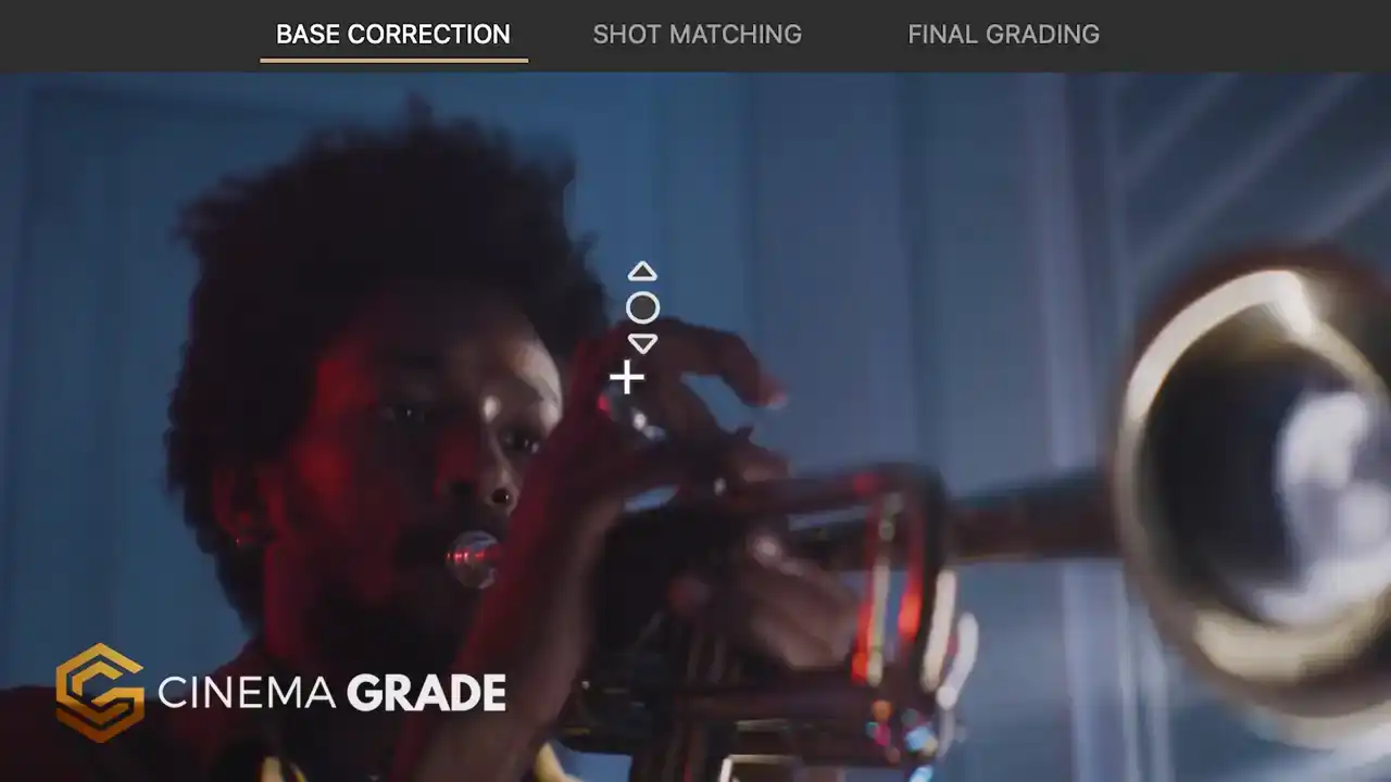
It's a plugin that works inside Premiere Pro, Final Cut Pro, and DaVinci Resolve.
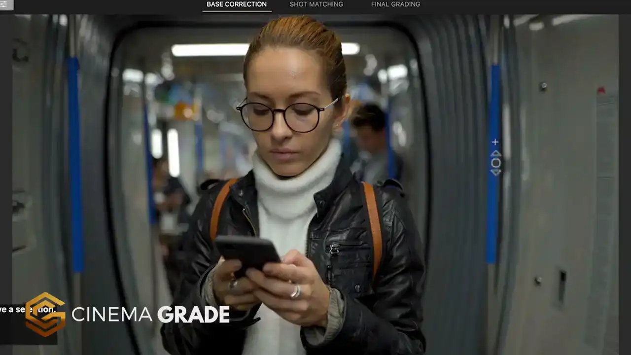
It empowers you to get cinema quality results without being overly complicated.
You're able to quickly transform footage from Log to Rec.709 using Asus Color Science, fix
exposure and color issues with point-and-click color grading in the viewer.
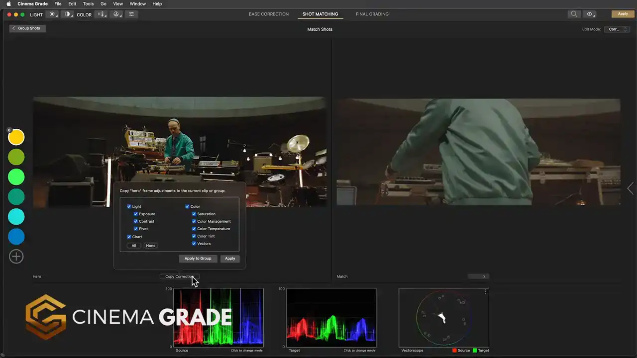
You're then able to group clips together, copying and pasting corrections between them
and apply an overall look to groups of clips which is a game changer to your workflow.
It features Lightroom style controls, false color for getting cinematic exposure, easy
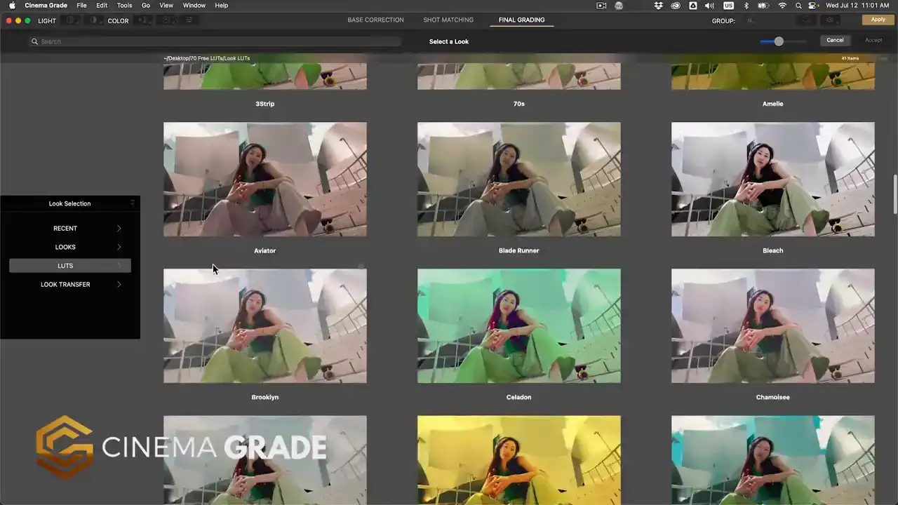
shot matching, real time previews of LUTs, and support for the X-Rite color checker chart
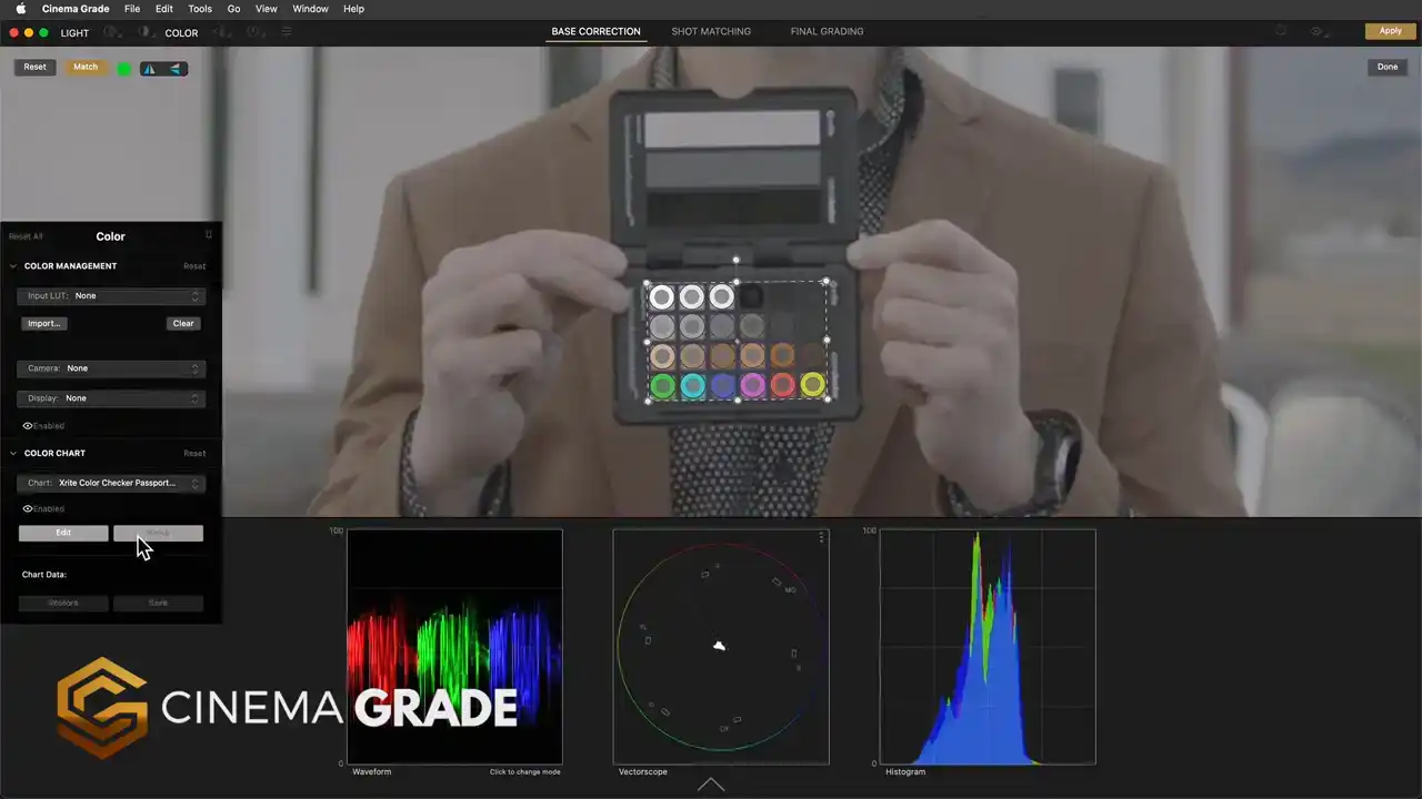
for doing automatic corrections.
You'll find a link for CinemaGrade in the description below and you can try it out risk free for 30 days and get 20% off with discount code MOVIE20 at checkout. For more videos like

this, click the subscribe button and then the bell to be notified of our next one. I'll see you in the next video. Let's make our color grading look like the movies.
Thank you.